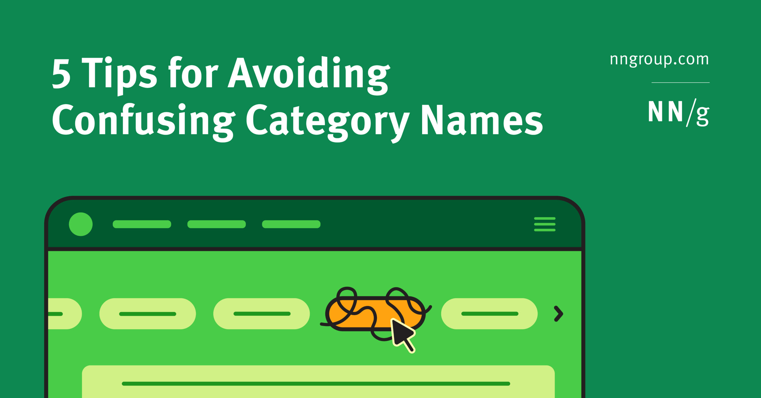
Summary: Category and link labels should tell users what will happen when they click on them. Deciding which category or link to click requires cognitive effort. If a page has many links, users must choose the one most likely to help them achieve their goal. This process can be exhausting, especially if the link names are […]
Read more »
Tagged
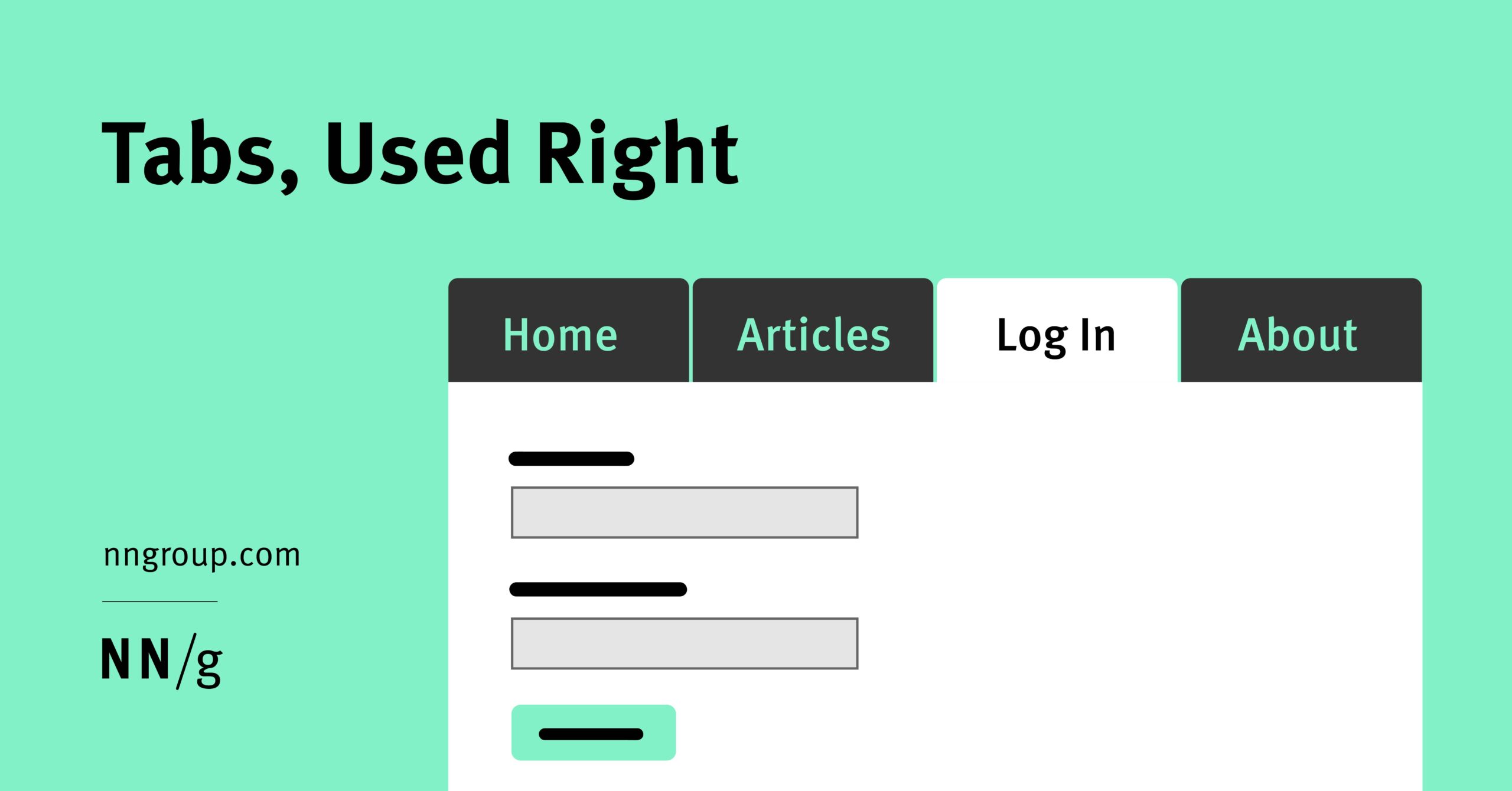
Summary: Tabs are everywhere, but do you use them properly? Distinguish between types of tabs, design them for visual clarity, and structure their content for usability. Tabs are a fundamental and frequently used control in interface design. For decades, the humble tab has enabled designers to organize and facilitate content navigation. In that time, tabs subtly […]
Summary: Labels in a card sorting study must be neutral to prevent keyword matching and encourage careful, conceptual groupings from users. Card sorting is a specialty UX research method used to understand users’ mental models of the information architecture (IA) within your digital product. Users organize individually labeled notecards into groups according to criteria that make […]
Summary: People rely on menus to find content and use features. Use this checklist to make sure your menus do their job. Too often, we observe users struggling with menus that are confusing, difficult to manipulate, or hard to find. Avoid common mistakes by following these guidelines for usable navigation menus. Make Navigation Visible This means […]
Summary: Card sort studies help shape information architectures; tree-testing studies evaluate them. Card sorting and tree testing are specialty UX-research methods used to design and evaluate information architecture (IA). Many newcomers to IA often confuse these two methods due to their similar goals of enhancing the site’s navigation and content structure. Card sorting is used to […]