

Introduction
Every day, humanity generates an astonishing 2.5 quintillion bytes of data — streaming from our smart devices, computers, sensors, and beyond. This avalanche of information reaches nearly every aspect of our lives, from weather forecasts to financial transactions, health and fitness stats, and progress updates. But while the data itself is vast and abundant, it rarely speaks for itself. Without context, raw numbers remain just that: raw.
Modern humans need data visualization to make sense of our world. A bar chart summarizes your spending patterns. A progress chart shows how close you are to your fitness goals. These visuals don’t just display information — they make it meaningful and actionable, by design.
This playbook is intended to be your guide to mastering the art of data visualization. Drawing inspiration from pioneers like Edward Tufte, who championed clarity and simplicity, we’ll explore how to transform numbers into compelling stories, from simple to complex. Let’s discover how to communicate data more effectively, produce designs more efficiently, and enjoy better outcomes through tested methodology and proven tools and resources.
What’s in this guide?
- How to approach a data visualization project
- Choosing the right method
- Tools and software for data visualization
- Data visualization resources
How to approach a data visualization project
Like any UX design, early decisions in data visualization can have a major impact on your product. Before getting into the weeds with technical details or debating tactics, it’s worth stepping back to consider the foundations — the strategic choices that will guide everything moving forward.
1. Start with the big picture
What story are you trying to tell? Who is your audience? Ask yourself: What insights should the visualization convey? Start with a clear purpose to make your designs align with user needs. For instance:
- Executives often prefer high-level dashboards with simple visuals.
- Analysts may need more granular visualizations, like scatter plots or heatmaps, to uncover patterns.
2. Prioritize clarity
The best designs are often the simplest. Avoid excessive chart “ink” and technical jargon.
- Use clear labels and legends (keys).
- Follow the “less is more” principle — remove elements that don’t directly enhance understanding.
3. Compare like with like
Your comparisons must be truthful to make sense. Remember the old adage, “statistics lie” — without proper context, numbers can be twisted to tell any story, a tactic often exploited by politicians to mislead audiences with skewed metrics.
- Ensure that the items being compared are logically similar. For example, “per capita” makes more sense than gross totals when data sets are different.
- If necessary, add annotations to explain differences or limitations in the data.
4. Maintain consistency
Stick to a single set of metrics, colors, and styles throughout your visualizations. For example, if tracking sales, use the same time periods and units of measurement.
- Random changes in formats imply some sort of meaning, often unintended and confusing.
- Consistent color schemes, fonts, and chart types prevent confusion and keep users focused on trends, not formatting.
5. Provide context
Sometimes, data visualization needs additional commentary to drive the point home — determine what editorial content may need to be included in your design.
- Add titles, annotations, or callouts to explain trends or anomalies.
- For example, if a chart shows a sales dip, a brief note explaining the cause (e.g., “seasonal decline”) can provide clarity.
6. Make it accessible
Accessible design practice makes your visualizations usable for all audiences, including people with disabilities.
- Check for sufficient color contrast between text, background, and chart elements to accommodate users with color vision deficiencies.
- Avoid relying solely on color to convey meaning. Add patterns, shapes, or labels for clarity.
- Include alt text for charts and images to describe key data insights.
- For digital dashboards, interactive features should be navigable via keyboard and screen readers.
7. Design it sustainably
Will the data need frequent updates? How will the updates be rendered?
- Build flexible visualizations that can be easily refreshed. For dashboards, consider tools that integrate live data updates.
- Match your design method to your project’s cadence — real-time dashboards need automation, while a static monthly report can allow for more manual design and bespoke art direction.
Choosing the right method
In this section, we will explore a range of formats, from simple and common to more complex and specialized. While there are often multiple ways to present a set of data, there is typically an ideal method for each specific task. The goal is to choose the simplest, most compact format that tells the story, while providing scalability for more detail as necessary.
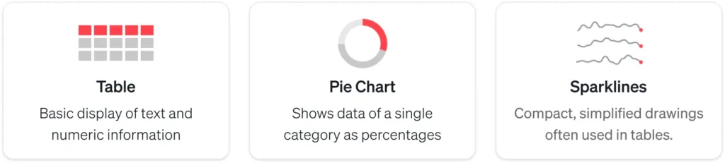
Basic data presentation
These chart types are used for presenting straightforward, often basic information, and are suitable for a range of scenarios:
1. Tables and variants
Tables are among the most versatile tools for presenting both text and numerical information. Organized into rows and columns, tables make it easy to structure and comprehend — provided that the headers and row labels make sense.
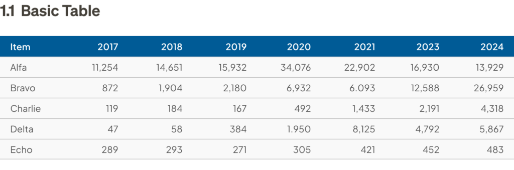
In addition to standard tables, software like Excel or Google Sheets can dynamically summarize, analyze, and explore data by grouping and filtering, in what’s known as pivot tables, where users can rearrange rows, columns, and values quickly. This flexibility makes them useful for business professionals to gain insights in real time, on the fly.

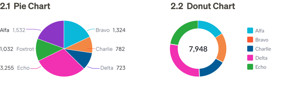
2. Pie charts and variants
Pie charts are one of the most iconic yet controversial tools in data visualization. While they are commonly used to display proportions, many experts argue that they are not the best method for comparing data. Edward Tufte has famously criticized pie charts for their inefficiency, as some people struggle to compare angles accurately.
Despite the controversy, pie charts remain popular for presenting high-level overviews. However, when clarity, precision, or detailed comparison is required, consider alternatives like a donut, square, or waffle chart for a better solution.

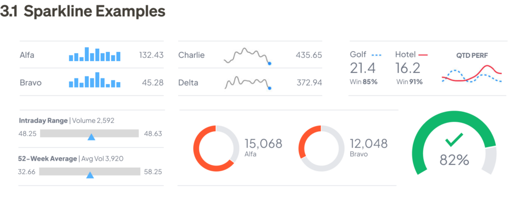
3. Sparklines
Sparklines are miniature charts that can be embedded within tables or displayed outside of standard X, Y axes. They are much smaller than regular charts and typically provide less detail. While sparklines can have labels, not every data point is typically marked. Despite being simplified, sparklines should still adhere to the same design principles as their larger counterparts.
Sparklines are most useful in dashboards, where key information can be viewed at a glance. They typically link to larger, more detailed visualizations for deeper analysis.
Comparing categories and trends
These types of charts are ideal for comparing different groups or tracking changes over time. Frequently used by business professionals to identify trends, track performance, and provide clarity in pattern analysis:
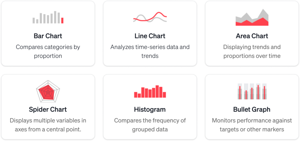
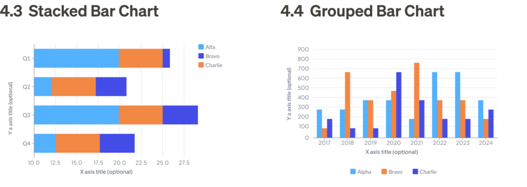
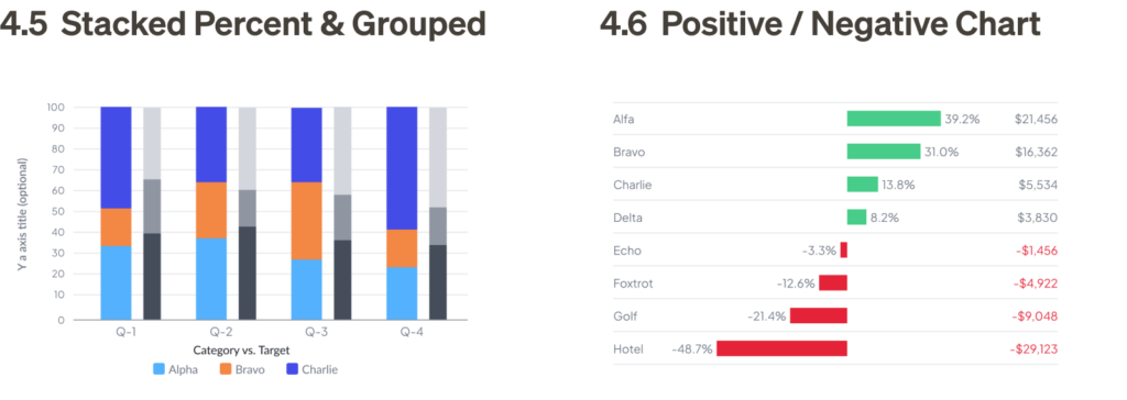
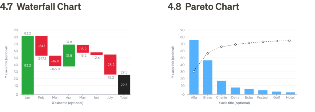
4. Bar charts
Bar charts are a common graph type used to present data by category with bars that are proportional to the values they represent. They require two variables, and each bar should start at zero to accurately represent proportional comparisons.
Bar charts are best used for simple category comparisons, and their compact design makes them easy to interpret. Variations of the bar chart can be used to communicate more complex information in a very straightforward way.

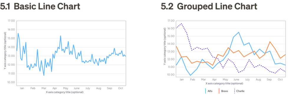
5. Line charts
Line charts are used similarly to bar charts, but they provide greater flexibility, especially when comparing numerous data points or when proportional differences are too small to discern clearly in a bar chart — a basic line chart does not require starting at zero, and can be zoomed into the scale of relevance for the data.
Line charts are ideal for displaying trends over time, and they allow you to narrow the focus to specific sets of data for comparison.
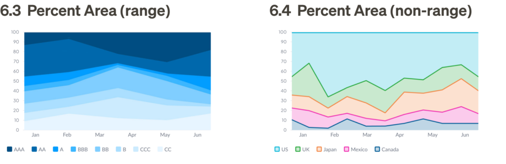
6. Area charts
Area charts are a variation of line charts that show both trends and proportions. These charts are especially effective when displaying cumulative totals, and they often use color shading to indicate volume. Like bar charts, area charts should start at zero to accurately display proportions. They are used to compare multiple quantities over time.

7. Spider chart and variants
Spider charts, also known as radar charts, visualize multiple variables across axes radiating from a central point, also known as polar coordinates. Each axis represents a different category, and data points are connected to form a shape, allowing for easy comparison across dimensions. Variants like radial charts use a more structured, concentric design to segment data into layers, often for skill mapping, progress tracking, or performance evaluation. Both formats effectively highlight patterns, strengths, and gaps in data, making them versatile tools for analysis.

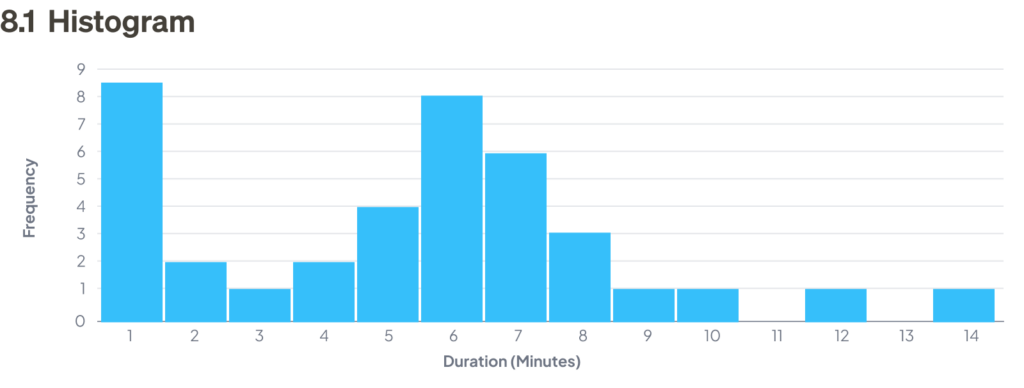
8. Histograms
Histograms, while visually similar to bar charts, serve a different purpose. Unlike bar charts, which measure the magnitude of categories, histograms measure the frequency of values, grouped into prescribed “buckets.” The first step in creating a histogram is defining the buckets and counting how many data points fall into each one. The frequency is then represented by bars.
Bars in histograms are adjacent to one another because they represent a continuous range of values. Typically, the bars are the same width and represent equal ranges, although this is not mandatory.
Histograms are useful for predicting macro trends in frequency based on a sample of data. The patterns formed by the bars — such as symmetric, unimodal, or bimodal — can help identify trends.
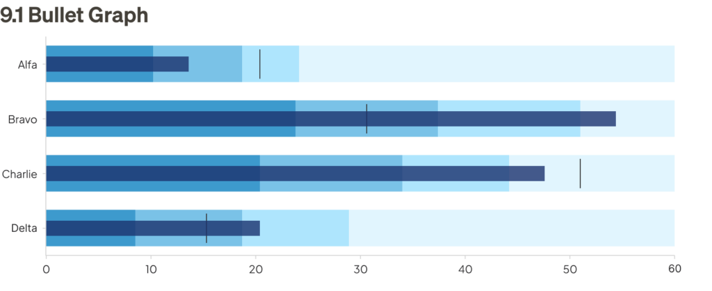
9. Bullet graphs
Bullet graphs are a compact combination of several features, such as a thermometer chart, progress bar, and target indicator, all within one stacked bar. These graphs are ideal for displaying performance against multiple benchmarks.
Bullet graphs are particularly useful in business analysis, as they compare actual performance to expectations using a simple format. The center line represents the actual value, the vertical line shows the target value, and the colored bands indicate performance ranges (e.g., poor, average, good).
Analyzing relationships and clusters
These types of charts are commonly used by data analysts to uncover relationships between variables, detect patterns, and analyze clusters within datasets. They are essential tools in fields such as market research, scientific analysis, and predictive modeling:

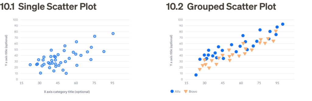
10. Scatter plots
Scatter plots display data points on an x/y coordinate plane, typically comparing two variables. They are useful for visualizing correlations between these variables, which can be positive (rising), negative (falling), or null (uncorrelated).
Scatter plots are powerful tools for visualizing distribution, trends, and outliers. They are most effective when plotting multiple data points rather than a single point over time.
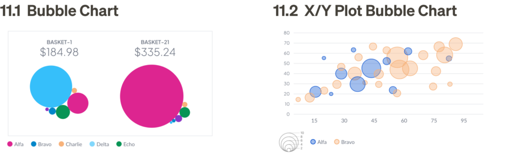
11. Bubble charts
Bubble charts are similar to scatter plots but are more flexible. Instead of just plotting on an x/y coordinate plane, they can also represent data with varying sizes or colors, allowing for a deeper level of analysis. These charts are useful for demonstrating the concentration of data points and are most effective when used as a feature of a visualization rather than a supporting element.
X/Y plot bubble charts are similar to scatter plots, but introduce a third variable — scale, as shown in bubble size. This allows for more complex visualizations and can be used in place of scatter plots if you have the three sets of data.
12. Pairplots
Pairplots are used by data scientists to discover correlations between multiple variables. A pairplot has two main components: diagonally, comparing the distribution of two different data sets, while non-diagonally, showing a single data set in two different chart formats. This setup allows data scientists to quickly assess relationships, such as whether two variables are correlated or if a variable follows a normal distribution.

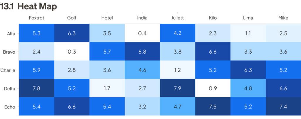
13. Heat maps
A heat map visually represents data in which values in a matrix are depicted as colors according to their density. Heat maps make it easy to scan measurements by grouping values into categories and displaying their density through color — the darker the color, the higher the density.
Distribution and outliers
These chart types are commonly used by data scientists, statisticians, and analysts to examine how data is spread or distributed and to identify anomalies or outliers. They are essential for tasks such as quality control, risk analysis, and understanding the variability in datasets:
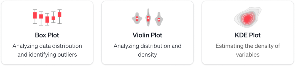
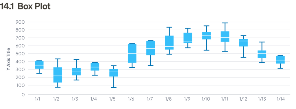
14. Box plots
Box plots (or box-and-whisker diagrams) are a simple way to show how data is spread out. They highlight five key points: 1) the minimum value, 2) the first quartile, 3) the median, 4) the third quartile, and 5) the maximum value. The chart has a box that shows where most of the data falls (the middle 50%), a line in the center for the median, and “whiskers” that stretch out to the lowest and highest values.
Box plots make it easy to see the distribution of data and identify trends in a compact format.
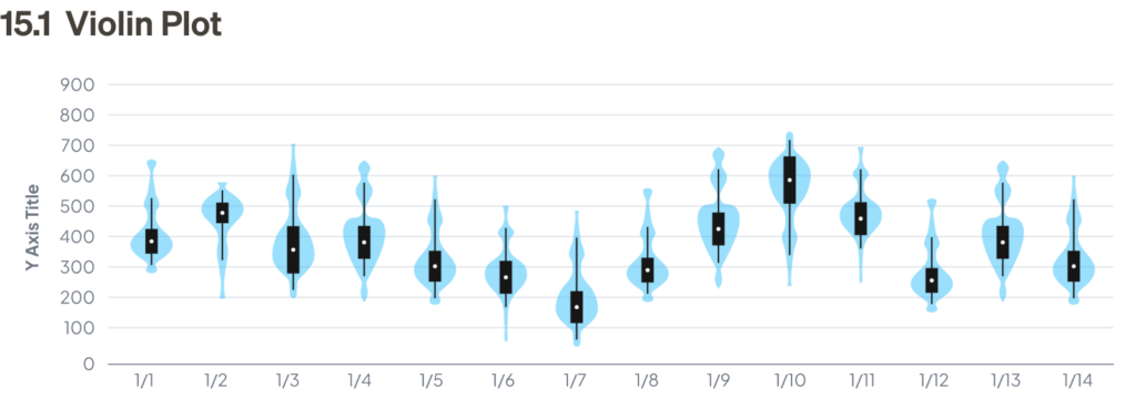
15. Violin plots
Violin plots are a mix of box plots and density plots, giving a fuller picture of how data is spread out. The outer shape shows the distribution, with its width showing how often certain values occur, like a histogram. Inside, there are layers that represent different portions of the data, and a dot in the center marks the median.
While violin plots give more details than box plots, they’re less commonly used because they can be harder to understand. For people unfamiliar with them, simpler charts like histograms or density plots might be easier to read.
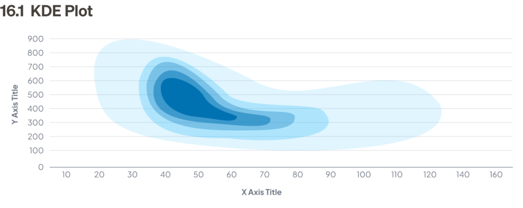
16. KDE plots
Kernel Density Estimation (KDE) plots show where values are most likely to appear, helping to visualize the overall distribution of data. KDE plots provide more nuanced insights compared to histograms and box plots. Unlike histograms, which require binning and thus limit resolution, KDE plots show a smooth representation of the data’s distribution, making them particularly useful for comparing multiple variables.
Specialized charts
These chart types are designed for specific scenarios and offer unique insights into specialized datasets:
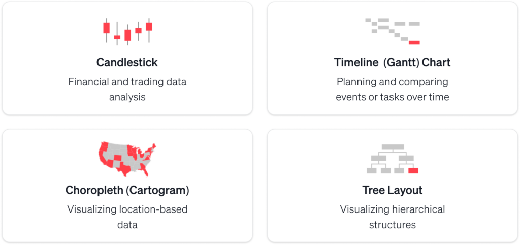
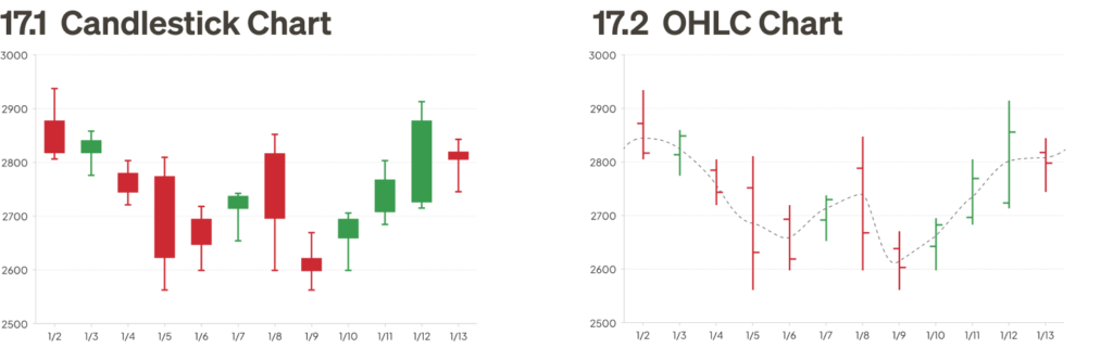
17. Candlestick charts
Candlestick charts are used to show how prices change for stocks, commodities, or currencies during a trading session. Each candlestick represents one session and shows four key details: the opening price, closing price, highest price, and lowest price. These candlesticks are displayed in a sequence, making it easy to spot trends and patterns in price movements.
18. Timeline/Gantt charts
A timeline or Gantt chart is a type of bar chart used to illustrate a project schedule. Tasks are typically broken down by rows, called “swim lanes,” and the horizontal bars measure time allocated for each task.
Detailed project plans can include additional information, such as deadlines, milestones, dependencies, and sprints. Timelines help project managers align expectations with team members throughout the project duration.

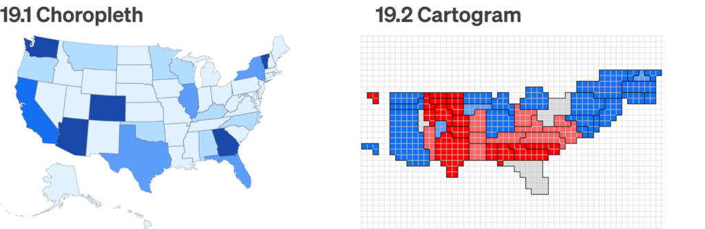
19. Choropleths/cartograms
Choropleths and cartograms are two key types of geographic maps used for data visualization.
A choropleth map shades areas on a map to visualize how a variable compares across geographic regions. A cartogram distorts geographic areas proportionally to represent a variable’s value, sometimes causing extreme distortions that make the map unrecognizable. Cartograms are most useful when the user is familiar with the geography enough to interpret the distortion.
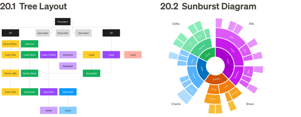
20. Tree layout and variants
Tree layouts and sunburst diagrams are hierarchical visualizations used to represent organization and flow. Both provide a clear view of parent-child relationships, but their formats differ: tree layouts are linear and directional, while sunburst diagrams use a circular structure for proportional representation.
Flow and network analysis
These charts are useful for visualizing processes, relationships, or network data, showing the movement or flow of information:
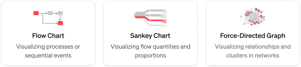
21. Flow charts
A flow chart is a diagram that represents a process, algorithm, or workflow. It uses boxes to represent steps, connected by arrows to indicate the direction of the flow. Diamond-shaped boxes represent yes/no questions that change the flow’s direction. Flow charts are useful for designing, managing, or documenting a process.

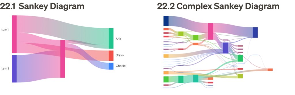
22. Sankey diagrams
Sankey diagrams are a type of flow chart where the width of the arrows is proportional to the flow quantity. These diagrams illustrate the transfers or flows within a defined system, typically showing conserved (lossless) quantities.
Sankey diagrams are highly effective for communicating relationships between two or more sets of data. They are powerful at showing trends, especially in systems with complex relationships.
23. Network/force-directed graphs
Network and force-directed graph algorithms are used to position graph nodes in a visually uncluttered way. These algorithms minimize edge crossings and use forces among edges and nodes to determine optimal positioning. They are particularly effective for showing relationships between points and analyzing complex interconnections. Two key variants are included below.

Tools and software for data visualization
Choosing the right software and platform
There are a variety of tools available for data visualization, each with its own strengths and considerations. Before choosing the right tool, it’s important to evaluate factors such as the tool category, overall capabilities, limitations, licensing or cost requirements, and the skill set needed for optimal use. The information below outlines the primary data visualization tools used across the industry:
General business design tools
These tools are primarily used for business-related design tasks such as reporting, dashboards, presentations, and data visualizations. They focus on functionality and practicality more than creative or aesthetic design work:
Tableau
Tableau is a powerful data visualization tool that can handle large datasets and create interactive, real-time visualizations. It supports a wide range of chart types and data integration from various sources, making it an excellent choice for more complex data analysis.
- Skills: Tableau is user-friendly for both beginners and advanced users, offering drag-and-drop functionality for quick visualizations as well as deep analytical capabilities for expert users.
- License: Requires a paid license for full functionality.
Looker Studio (formerly Google Data Studio)
Looker Studio is a powerful tool for creating interactive data reports and dashboards. It allows users to pull data from a variety of sources, including Google Analytics, Google Ads, Google Sheets, and many third-party platforms. Looker Studio is excellent for creating interactive reports that can be shared and embedded. However, its limitations include fewer customization options compared to other professional design tools and some performance issues with very large datasets.
- Skills: Looker Studio is designed for both non-technical users and professionals. It’s user-friendly with drag-and-drop functionality, making it easy for business teams to create data visualizations without requiring deep technical skills. For more complex features, users may need basic knowledge of SQL or data manipulation.
- License: Free to use, though it offers premium features through Looker, a more enterprise-focused platform. The basic version covers most business data visualization needs.
Microsoft Excel
Excel is widely used for data visualization, particularly through pivot tables, charts, and graphs. Its limitations include a lack of advanced data integrity controls and performance issues with large datasets.
- Skills: Excel is accessible to general audiences, and most business users can quickly utilize its basic data visualization features.
- License: Typically, no special license is required for most business users (assuming standard Office 365 or standalone Excel license).
Microsoft PowerPoint
PowerPoint is often used for creating presentations with basic graphs and charts. Its limitations include the lack of advanced analysis tools, and it can be difficult to prepare and input data for graphics.
- Skills: PowerPoint is user-friendly and accessible to general audiences for simple data visualization tasks like charts and diagrams.
- License: PowerPoint is included in standard Office licenses (Office 365, Microsoft 365).
Microsoft Project
Microsoft Project is primarily used for project management tasks like tracking processes, allocating resources, and managing budgets. It’s more focused on project scheduling and resource management rather than advanced data visualization.
- Skills: While general users can use it, Microsoft Project is more geared towards project managers and may require more specialized knowledge.
- License: Microsoft Project usually requires a separate license, distinct from the standard Office suite.
Microsoft Visio
Visio is widely used for diagramming and creating business process visualizations, flowcharts, and diagrams. It’s useful for outlining processes, but advanced diagramming may require some expertise.
- Skills: It can be used by general audiences, but more complex diagrams may require familiarity with advanced templates and features.
- License: Visio typically requires a separate license, usually not included in the standard Office suite.
Designer tools
These tools are typically used by designers for creating high-quality, detailed designs. They offer advanced functionality for graphic design, prototyping, animation, and data visualization, among other creative tasks:
Figma plugins for data visualization
When designing data visualizations in Figma, several plugins can significantly enhance your workflow, making it easier to create dynamic, data-driven designs. Below are some of the most popular Figma plugins for data visualization, each offering unique features to help you generate charts, sync data, and visualize connections more efficiently.
U-Chart
A remarkable, powerful tool for creating a wide range of data visualizations, especially useful for prototyping, with a wide range of features for customization.
Plug-in by: Uwarp Studio
License: Free
Link: https://www.figma.com/community/plugin/1404821057322599271/uchart
Google Sheets Sync
A must-have plugin for a variety of workflows — if your data is stored in Google Sheets, this plugin syncs it with your Figma design, enabling automatic updates to visualizations for real-time data accuracy. However, if the data changes after the initial sync, a manual refresh is required.
Plugin by: Dave Williames
License: Free
Link: https://www.figma.com/community/plugin/810122887292777660/Google-Sheets-Sync
Chart
This plugin allows you to create various types of charts directly in Figma, such as bar, line, pie, and scatter charts. It pulls in data from a CSV file or allows manual entry. It’s a simple way to quickly generate basic data visualizations without leaving the design tool.
Plugin by: Pavel Kuligin
License: Free for basic use only. Accessing full features requires a small annual subscription fee.
Link: https://www.figma.com/community/plugin/734590934750866002/chart
Figmotion
Figmotion is a powerful plugin that adds animation to your Figma designs, making it especially useful for creating dynamic data visualizations, such as animated bar charts or transitioning pie charts.
Plugin by: Liam Martens
License: Free
Link: https://www.figma.com/community/plugin/733025261168520714/figmotion
Table Generator
This handy plugin automatically creates tables in Figma by pasting CSV-formatted text, allowing you to input data quickly into a tabular format. It’s highly efficient for rapid input of real data, especially when using ChatGPT to format your text. The downside is that it lacks systemization and auto-layout features, and may need manual adjustments for optimal styling.
Plugin by: Zwattic
License: Free
Link: https://www.figma.com/community/plugin/735922920471082658/table-generator
Autoflow
Autoflow allows you to connect design elements in Figma, which is useful for creating flow diagrams or visualizing connections between different data sets. It’s especially helpful for designing network diagrams or process flows.
Plugin by: David Zhao and Yitong Zhang
License: Free for up to 50 flows. Subscription fee for unlimited access.
Link: https://www.figma.com/community/plugin/733902567457592893/autoflow
Discover more Figma plugins here: https://www.figma.com/community/tag/data-visualization/plugins
Design templates for data visualization
Service Now
Designers can fully leverage data visualizations and dashboards within ServiceNow’s ecosystem, which utilizes the Polaris design system as part of a broader offering — a powerful, modern design system scalable for enterprise. By incorporating these visualizations, designers can elevate the overall user experience, create rapid prototypes and efficient workflows while facilitating better collaboration across teams in large-scale initiatives.
Templates by: ServiceNow
License: Free
Link: https://www.figma.com/@servicenow
Kiss Data Design System
A great data visualization kit with a simple, yet robust design system makes it easy to customize and reuse the branding of your designs.
Templates by: Eric Xie – 360 Data Experience and Mifu
License: Free
Link: https://www.figma.com/community/file/1029955624567963869/kiss-data-a-data-visualization-design-system
Advanced Data Visualization
A highly configurable data visualization kit for Figma, with both basic and advanced chart types, in smartly componentized formats.
Templates by: Mingzhi Cai
License: Free
Link: https://www.figma.com/community/file/1258847030939461287
r19 Data Visualization Kit
A thorough collection of data visualization, simple and effective for basic and advanced chart types.
Templates by: Anton Malashkevych
License: Free
Link: https://www.figma.com/community/file/1047125723874245889/r19-data-visualization-kit
Data visualization resources
Core references and books
- Edward Tufte — Pioneering work on information design and visual display of quantitative information
- Perceptual Edge — Stephen Few’s resource for data visualization best practices and business intelligence
- Alberto Cairo’s website features his work and insights as a leading visualization designer and educator.
- Data Visualization Catalogue — Comprehensive guide to different chart types and their uses by Severino Ribecca
Learning and community
- Information is Beautiful — Award-winning visualizations and resources by David McCandless
- Flowing Data — Nathan Yau’s blog featuring tutorials and visualization examples
- Nightingale — Journal focusing on data visualization theory and practice by Data Visualization Society
- VizHub — Platform for learning and creating interactive data visualizations
Technical resources
- D3.js — Powerful JavaScript library for creating custom web-based visualizations
- Observable — Platform for creating and sharing interactive data visualizations
- Plotly — Open-source graphing libraries for multiple programming languages
- Chart.js — Simple yet flexible JavaScript charting
- Vega — Declarative visualization grammar for creating interactive graphics
- Raw Graphs — Open-source tool for creating quick visualizations from data
Design systems and guidelines
- Google Material Design — Comprehensive guidelines for data visualization
- IBM Carbon — Enterprise-focused data visualization principles
- Tableau Best Practices — Guidelines for effective dashboard design
- Financial Times Visual Vocabulary — Chart type selection guide
Blogs and expert resources
- Visual Cinnamon — Nadieh Bremer’s blog on creative data visualization
- DataViz Project — Visual encyclopedia of chart types
- Storytelling with Data — Cole Knaflic’s blog on effective data communication
- Multiple Views — Academic research explained for practitioners
- PolicyViz — Jon Schwabish’s blog on data visualization in public policy
- Duke University Library — Reference and Best Practices
Interactive learning
- DataCamp — Online courses in data visualization
- Coursera Data Visualization — University-level courses
- Seeing Theory — Visual introduction to probability and statistics
Final thoughts
I hope this playbook provides valuable insights and practical guidance to help you visualize data on your next project. If you have any feedback or would like to share your experiences with data visualization, please feel free to comment or reach out. I look forward to hearing from you and learning from your perspective!
The article originally appeared on Medium.
Featured image courtesy: Jim Gulsen.
The post The Ultimate Data Visualization Handbook for Designers appeared first on UX Magazine.